TFL bike rentals
Monthly changes in TFL bike rentals.
We can easily create a facet grid that plots bikes hired by month and year.
library(scales)
facet_monthly_bike_rentals <- bike %>%
  filter(year >= 2015)%>%
  ggplot(aes(x = bikes_hired))+
    geom_density()+
    facet_grid(vars(year), vars(month))+

    scale_x_continuous(labels = number_format(scale = 1/1000, suffix = "K"))+

    theme(axis.text.y = element_blank(), plot.background = element_blank(), panel.background = element_blank(), panel.grid = element_line(color = "lightgrey"), strip.background = element_blank())+

    labs(title = "Distribution of bikes hired per month", x = "Bike Rentals")


facet_monthly_bike_rentals
Look at May and Jun and compare 2020 with the previous years. What’s happening?
It is observable, that the distribution of bike rentals in May and June tends to be more concentrated and centralised around 40,000 daily bike rentals than in many of the other months. This might be due to the fact that temperatures and the overall weather is more stable in these months, and thus there is less fluctuation in daily demand. Looking at the overall distribution of bike rentals in 2020 compared to the previous years, the first two months seem similar. However, starting from March, a shift in distribution towards the left, can be seen, indicating that bike rentals incurred a period of less demand. This can likely be attributed to the outbreak of the COVID19 pandemic, and people staying home more frequently. This trend continues until the month of June, from which bike rentals follow the previous years’ distributions more closely once again.
monthly_mean <- bike %>%
  filter(year %in% c(2016, 2017, 2018, 2019)) %>% #We filter for these years, as they are the only ones relevant to the calculation of the mean
  group_by(month) %>%
  summarise(mean_demand = mean(bikes_hired)) #we calculate the mean bike rentals per month for the period from 2016 until 2019
# We need to make month numeric in order for the line plot to be displayed properly.
month <- c("Jan", "Feb", "Mar", "Apr", "May", "Jun", "Jul", "Aug", "Sep", "Oct", "Nov", "Dec")
mon_num <- 1:12
df_month <- tibble(month, mon_num)
df_month #we allocate each number to the respective month, so that we can bind the numbers to the actual bike data table## # A tibble: 12 × 2
## month mon_num
## <chr> <int>
## 1 Jan 1
## 2 Feb 2
## 3 Mar 3
## 4 Apr 4
## 5 May 5
## 6 Jun 6
## 7 Jul 7
## 8 Aug 8
## 9 Sep 9
## 10 Oct 10
## 11 Nov 11
## 12 Dec 12bike_diff <- bike %>%
left_join(df_month, by = "month") %>%
left_join(monthly_mean, by = "month") %>% #We join the monthly mean (2016-2019) and the month numbers to the bike data table
group_by(year, month, mon_num) %>%
summarise(bikes_hired_month_avg = mean(bikes_hired), mean_demand = mean(mean_demand), mon_num = mean(mon_num)) %>% #we calculate the actual mean of bike rentals per month. Compared to the other mean however, we limit this calculation to just the respective year, instead of across the four years from 2016 - 2019
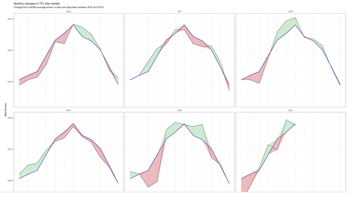
mutate(diff_exp = mean_demand - bikes_hired_month_avg, less_than_mean = if_else(diff_exp >= 0, -diff_exp, 0), more_than_mean = if_else(diff_exp < 0, -diff_exp, 0)) #we introduce two new variables, that either become the difference between the present month's mean and the total mean or 0, depending on the sign of the difference. We introduce this variable, in order to be able to differentiate between when to colour our ribbon red or green at a later stage.## `summarise()` has grouped output by 'year', 'month'. You can override using the `.groups` argument.plotActualForecast <- bike_diff %>%
filter(year %in% c(2016, 2017, 2018, 2019, 2020, 2021)) %>%
ggplot(aes(x = mon_num))+
geom_line(aes(y = bikes_hired_month_avg))+
geom_line(aes(y = mean_demand), color = "#2d0fd7", size = 1)+
geom_ribbon(aes(ymin = mean_demand, ymax = mean_demand + more_than_mean), fill = "#7DCD85", alpha = 0.4)+
geom_ribbon(aes(ymin = mean_demand, ymax = mean_demand + less_than_mean), fill = "#CB454A", alpha = 0.4)+ #here we go ahead with our implementation of different colour per ribbon, depending on whether the actual monthly mean is bigger than the overall one or not. This is done by varying the upper limit in ymax: If we don't want one colour, this upper limit is essentially equal to the lower one such that no ribbon gets drawn.
facet_wrap(vars(year))+
labs(title = "Monthly changes in TFL bike rentals", subtitle = "Change from monthly average shown in blue and calculated between 2016 and 2019", x ="Month", y = "Bike Rentals")+
scale_x_discrete(limits = month)+
theme_bw()+
theme(strip.background = element_blank())
plotActualForecast
weekly_mean <- bike %>%
  filter(year %in% c(2016, 2017, 2018, 2019, 2020, 2021)) %>%
  select("bikes_hired", "week") %>%
  group_by(week) %>%
  summarise(weekly_avg = mean(bikes_hired)) #similarly to the overall month mean, we calculate the overall week mean
joinedWeeklyBike <- bike %>%
left_join(weekly_mean, by = "week") %>% #we join the overall weekly averages with the actual data table
select("year", "week", "bikes_hired", "weekly_avg") %>%
group_by(year, week) %>%
summarise(actual_week_avg = mean(bikes_hired), weekly_avg = mean(weekly_avg)) %>%
mutate(percChange = (actual_week_avg-weekly_avg)/weekly_avg) #we calculate the percentage change, which we plot against the weeks## `summarise()` has grouped output by 'year'. You can override using the `.groups` argument.joinedWeeklyBike <- joinedWeeklyBike %>%
filter(year %in% c(2016, 2017, 2018, 2019, 2020, 2021))
plotWeeklyBike <- joinedWeeklyBike %>%
ggplot(aes(x = week))+
geom_line(aes(y = percChange))+
geom_ribbon(aes(ymin = 0, ymax = if_else(percChange >= 0, percChange, 0)), fill = "#7DCD85", alpha = 0.4)+
geom_ribbon(aes(ymin = if_else(percChange < 0, percChange, 0), ymax = 0), fill = "#CB454A", alpha = 0.4)+ #we vary the lower and upper limits of the ribbon, in order to accurately fill the area between the graph and the x axis
geom_rug(data = joinedWeeklyBike, sides = "b", colour = if_else(joinedWeeklyBike$percChange >= 0,"#7DCD85","#CB454A"))+ #we include geom_rug to depict the small lines above the x axis, indicating a positive or negative value of percentage change in either green or red
facet_wrap(vars(year))+
theme_bw()
plotWeeklyBike
It makes sense to use the mean for calculating expected rentals, as we really need to take very low and very high numbers into consideration. If one were to use the median, and thereby ignore outlying values, the supply might not be well prepared for keeping up with demand on specific days.
Maximilian Stock
Masters Candidate at London Business School
I am currently trying to better understand Machine Learning. Also, I am passionate about the world of sports.