German Election Polls
Evolution of voting percentages for the 2021 German election.
Getting the data
url <- "https://en.wikipedia.org/wiki/Opinion_polling_for_the_2021_German_federal_election"
# https://www.economist.com/graphic-detail/who-will-succeed-angela-merkel
# https://www.theguardian.com/world/2021/jun/21/german-election-poll-tracker-who-will-be-the-next-chancellor


# get tables that exist on wikipedia page
tables <- url %>%
  read_html() %>%
  html_nodes(css="table")


# parse HTML tables into a dataframe called polls
# Use purr::map() to create a list of all tables in URL
polls <- map(tables, . %>%
             html_table(fill=TRUE)%>%
             janitor::clean_names())


# list of opinion polls
german_election_polls <- polls[[1]] %>% # the first table on the page contains the list of all opinions polls
  slice(2:(n()-1)) %>%  # drop the first row, as it contains again the variable names and last row that contains 2017 results
  mutate(
         # polls are shown to run from-to, e.g. 9-13 Aug 2021. We keep the last date, 13 Aug here, as the poll date
         # and we extract it by picking the last 11 characters from that field
         end_date = str_sub(fieldwork_date, -11),

         # end_date is still a string, so we convert it into a date object using lubridate::dmy()
         end_date = dmy(end_date),

         # we also get the month and week number from the date, if we want to do analysis by month- week, etc.
         month = month(end_date),
         week = isoweek(end_date))
Plotting the data
Now that we have fetched all the data from the wikipedia table into our german_election_polls data frame, let’s try to visualize our data.
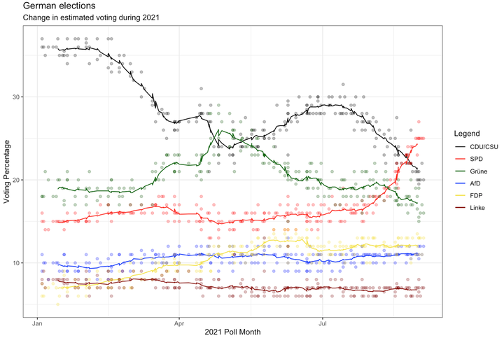
plot_election_polls <- ggplot(german_election_polls, aes(x = end_date))+ #because we have multiple lines (representing multiple parties), we only map the x axis uptop here. We map y-values when we create every scatter and line plot separately for each party.

  geom_point(aes(y = union), color = "black", alpha = 0.3)+
  geom_line(aes(y=rollmean(union, 14, na.pad=TRUE), color = "black"))+ #we add a line representing the rolling average of values for the past 14 days. We also adjust the padding for enhanced visualization.+

  geom_point(aes(y = spd), color = "red", alpha = 0.3)+
  geom_line(aes(y=rollmean(spd, 14, na.pad=TRUE), color = "red"))+

  geom_point(aes(y = grune), color = "darkgreen", alpha = 0.3)+
  geom_line(aes(y=rollmean(grune, 14, na.pad=TRUE), color = "darkgreen"))+

  geom_point(aes(y = af_d), color = "blue", alpha = 0.3)+
  geom_line(aes(y=rollmean(af_d, 14, na.pad=TRUE), color = "blue"))+

  geom_point(aes(y = fdp), color = "#F4E332", alpha = 0.3)+
  geom_line(aes(y=rollmean(fdp, 14, na.pad=TRUE), color = "#F4E332"))+

  geom_point(aes(y=linke), color = "darkred", alpha = 0.3)+
  geom_line(aes(y=rollmean(linke, 14, na.pad = TRUE), color = "darkred"))+


  #we have desperately tried to add a functioning legend to our plot. We finally managed to do so with the scale color identity function, after mapping the correct colors to the variable aesthetics before. Inspiration for this code came from https://aosmith.rbind.io/2018/07/19/manual-legends-ggplot2/
  scale_color_identity(breaks = c("black", "red", "darkgreen", "blue", "#F4E332", "darkred"),
                          labels = c("CDU/CSU", "SPD", "Grüne", "AfD", "FDP", "Linke"),
                          guide = "legend",
                          name = "Legend")+

  labs(title = "German elections", subtitle = "Change in estimated voting during 2021", x="2021 Poll Month", y="Voting Percentage")+

  theme_bw()

plot_election_polls
## Warning: Removed 13 row(s) containing missing values (geom_path).
## Warning: Removed 13 row(s) containing missing values (geom_path).
## Warning: Removed 13 row(s) containing missing values (geom_path).
## Warning: Removed 13 row(s) containing missing values (geom_path).
## Warning: Removed 13 row(s) containing missing values (geom_path).
## Warning: Removed 13 row(s) containing missing values (geom_path).
Maximilian Stock
Masters Candidate at London Business School
I am currently trying to better understand Machine Learning. Also, I am passionate about the world of sports.